
The power of painting lies in color. The artist’s color choices will bring vibrancy and emotion to the piece and facilitate the intent and mood. Throughout history, artists have been fascinated by the colors that they used on their palettes, from the primitive earth pigments to the vivid chemical colors that we have today. Analyzing how the artists’ color schemes changed reveals developments in technology, materials used, and the widened scope of artists.
In this blog, we will submerge into the alluring world of color and understand its fundamental significance in art history. We will trace pigments across different ages, from their origin, charcoal, and clays to lapis and cochineal.
How the great masters symbolically created colors, concepts, and techniques in their famous artworks. Among other things, we will see how modern artists widen the range of artistic color use.
Let us embrace this journey together to witness the magic of color on the canvas as it has been used in art through the centuries.
1. The Origins of Pigments

Humans have experimented with color since prehistoric times, using primitive earth pigments like air drying clay, soils, and charcoal to make powder paint for cave wall decoration. Vivid new pigments became available as trade and technology advanced. Lapis lazuli, rich ultramarine blue, was imported from Afghanistan in the 6th millennium BC.
In Ancient Egypt, bright synthetic pigments such as Egyptian blue and green were produced. The Ancient Greeks and Romans expanded the artistic palette with mined and manufactured pigments. By the Middle Ages, a broad spectrum of vivid pigments was available through trade, allowing Medieval and Renaissance artists to explore color creativity.
However, fine-colored pigments were costly as they were imported from Asia and Africa. Only the most skilled artists could work in full, luminous color using these pigments that had to be painstakingly ground into powder paint.
2. The Modern Color Revolution
It was in the late 19th and 20th centuries that a truly extensive palette became widely available with new synthetic pigments. This allowed color to take a central role in art as we think of it today. Impressionists and other modern artists could work in pure, vibrant hues.
Bold and expressive uses of color defined many modern art movements. The Fauves used stark colors in simplified forms that shattered conventions. Expressionists squeezed straight pigment onto canvases in evocative, vibrant styles. Pop artists elevated the neon-bright colors of consumerism and commercial goods. Abstract artists like Rothko experimented with color fields and the power of pure color alone.
3. The Meaning Behind Color in Art
Color is consistently symbolic in art. Different hues convey distinct emotions and meanings that artists skillfully exploit—warm colors like red, orange, and yellow project sensations of heat, energy, and excitement. The colors such as blue, green, and violet have a cooler characteristic and thus are calmer and quieter.
Specific shades are symbolic as well. Red is passion, desire, seduction, or violence. Blue is the symbol of silence, spirituality, and honesty. White evokes the notions of purity and holiness, whereas black manifests mystery, emptiness, and death.
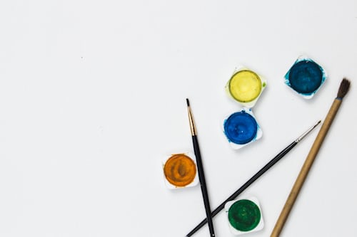
4. The Mixtures on the Palette
Masterful color use isn’t just about picking the perfect single pigments. Artists blend, layer, and juxtapose colors to create desired effects. Mixing primary colors yields secondary hues – violet, orange, green. Complimentary colors, opposite on the color wheel, create high contrast when paired. Adding white makes tints, black makes tones, and gray desaturates hues. With all this interplay, artists can capture subtle gradients, mix naturalistic flesh tones, and make colors pop or recede spatially. The possibilities are endless.
5. Famous Palettes in Art History
Examining individual artists’ color choices shows their unique vision and craft.
– Van Gogh painted in vivid swirls laden with thickly layered paint. His palettes were bright and vibrant, using contrasting hues like violet against yellow.
– Monet’s shimmering landscapes utilized cleverly mixed diluted greens, blues, and violets to showcase the nuances in light and color. His palette knife technique is all. They produced light pigments to mix optically.
The possibilities of color among artists are infinite. The artist’s particular choices inform the viewer and become the essence of the lasting potency of artwork.
6. Pigments and Paints
Of course, an artist is only as good as their materials. Paints consist of finely ground pigments suspended in oil, acrylic, tempera, or watercolor. The type of paint dramatically affects the color and handling. Opaque oils and acrylics allow artists to layer and mix hues, while translucent watercolor relies on the white paper shining through transparent washes.
Paints differ in their permanence, too. Like flake white lead, many historic pigments were unstable and gradually shifted tone. Today’s acrylics and modern pigments offer artists a vast, permanent palette. Understanding paint qualities allows them to use color confidently and archivally.
7. Color Exploration in Contemporary Art
Today’s artists continue expanding color possibilities. New artificial pigments broaden the palette with exceptionally brilliant phosphorescent colors. Painters layer acrylics and gels for dimensional texture. Digital tools allow limitless tweaks to hue, saturation, and brightness. Visionary artists use color in fresh, unexpected ways.
Installations envelop viewers in pools of colored light. Photographs capture the color phenomena of nature. Paint is blended with materials like sand or porcelain. The work of contemporary artists pushes the boundaries of what color in art can be.
Conclusion
Across all eras and genres, color has an unparalleled impact on art. A masterful color palette can make a work sing. Even simple minimalist compositions resonate through carefully chosen hues. Color conveys both symbolic meaning and directly felt sensation. It creates mood, energy, and poetry.
Next time you visit a museum or gallery, pause and appreciate the colors selected by visionary artists. Notice how they relate through harmony and contrast. Observe the meanings and emotions evoked. Lose yourself in the mesmerizing power of color, the true palette of the imagination.


Be First to Comment